
Instructions
This template is made for food bloggers who need a beautiful website to post their recipes on.
Structure
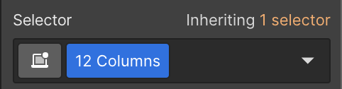
The structure of this template is built primarily using a 12-column layout structure.
- To create a column layout, a section will need a parent div block with a class of “12 Columns”. Combo classes are available to change alignment.
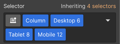
- Then, place div blocks with the class of “Column” inside. These will turn into your columns so there should be as many as you need.
- Then, you can add a specific combo class that will determine the numbers of columns the content utilizes. For example, a layout with content on the left and an image on the right might use the combo class of “Desktop 6” for both columns. This means each block will take up 6 columns, or 50% of the available width.
- Combo classes can be added to change width of column for tablet and mobile devices.
Sections and containers
Sections and containers should be used for each block of content. Sections organize content and apply top and bottom padding to the block. Containers set a maximum width that responds with the device size. Both sections and containers have classes and combo classes for variations that you can reference below.
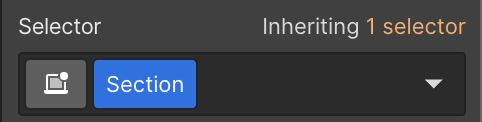
Applied to Webflow section element, this adds top and bottom padding to the content.
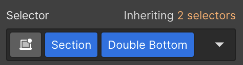
Doubles bottom padding found in Section class.
Applied to div block nested inside section element. This limits all content to a maximum width.
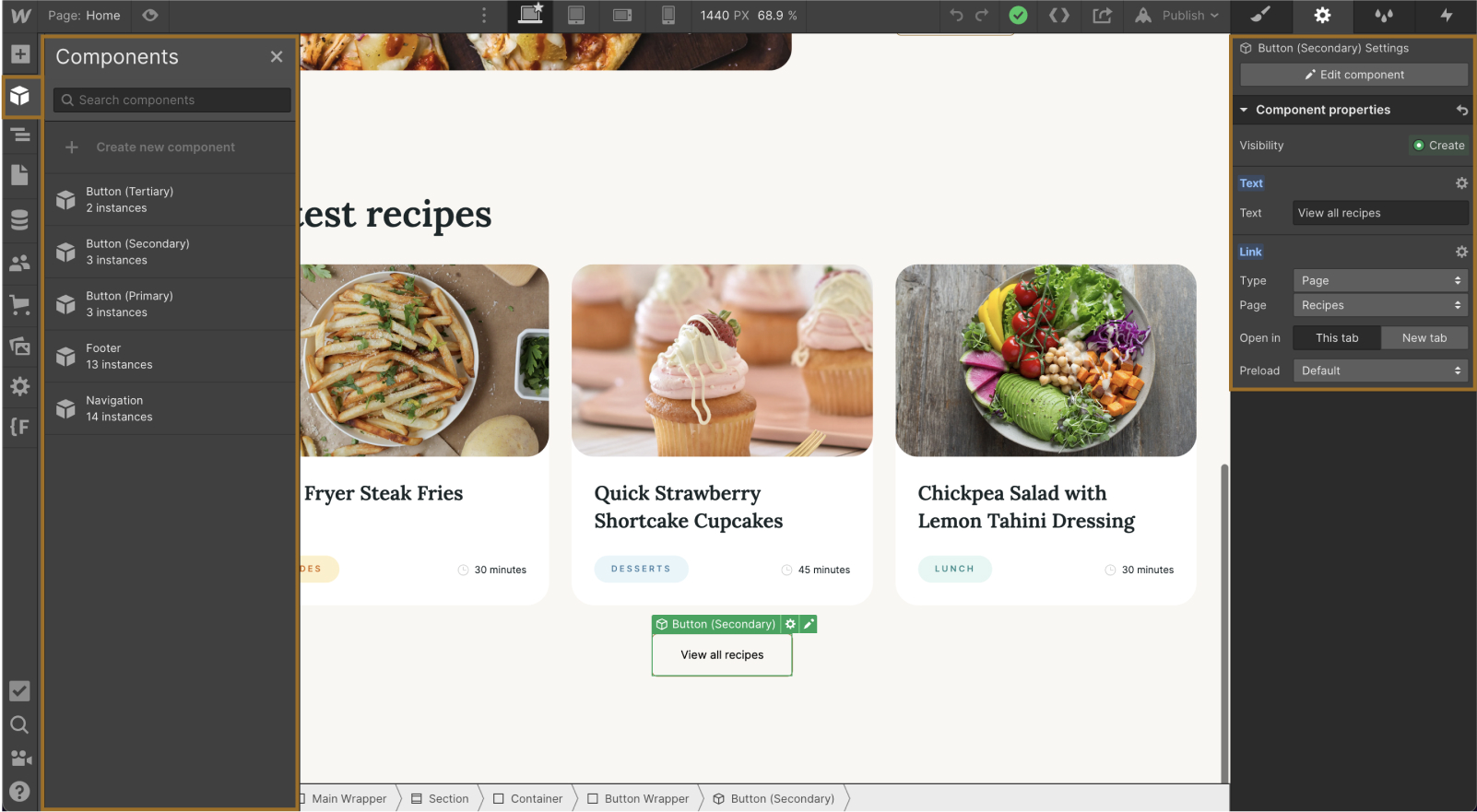
Components
This template uses components for recurring elements to allow for quick and easy page building. The template has symbols for the navigation, footer and buttons that are repeated throughout the site. Symbols can be used in two ways:
- Identical content for each instance: This is useful for the navigation and footer where it should be identical on every page. Making a change to the instance in one place will update it on every page.
- Unique content: When you need to change the text or link on a component, such as on a button, you can access these settings in the right panel under Component Properties.
How to use
- Access the components in the left toolbar. Select the desired component to place it on the page.
- Double-click into the component to globally update any text or images. Or, if the symbol should be a unique instance, adjust the settings on the right.
Style guide
A style guide is provided to easily update styles that will change globally on the site. Visit the style guide here.
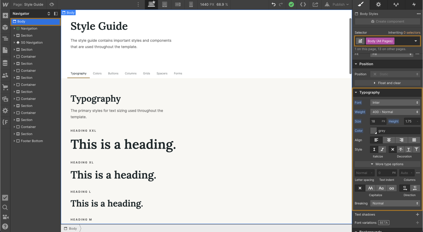
Typography
- Updating the font and font sizes should be done in the style guide. To update the primary font, select the Body element and then choose the Body (All Pages) tag from the style panel. Making changes here will update the font across the entire project.
- To update headline font and sizes, select each headline and then change to your desired styling.

Colors
- To change the website colors, navigate down to the colors section in the style guide. Select one of the color blocks. In the style panel, select the background color. In the pop-up, choose the pencil icon to change the primary color. This will change the color across the entire site.
More information
For further information, please visit Webflow University for in-depth tutorials.